Situation
Sparta is one of the biggest socks manufacturers in the Baltic States. They have been producing quality socks for more than a hundred years. The brand image, however, has started to look outdated and economical. It contradicted the quality products of Sparta and missed the opportunity to appear on the top shelves amongst competitors.


Solutions
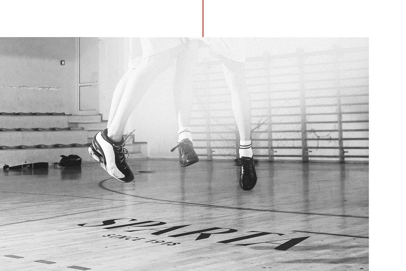
The inspiration for a new visual ID came from the famous fashion houses and luxury shops. Their mostly font-based logos usually use classical fonts with serifs for a clean, minimal look. In the same spirit we created a logo which is bold, visible and enriched with the contemporary typographic details.


What's Golden?
Despite being of classical mood, the logo also keeps the essence of time-tested brand.
It keeps the perfect balance between the curves, thin & thick lines.
It keeps the perfect balance between the curves, thin & thick lines.